During a pretty solid department seminar recently I got to add some tallies in the back of my Office Book (like a field book but for inside science). Since 2007 I’ve been keeping track of a few things in the back of a Moleskine notebook that I use for seminars, meetings, and most other non-field functions. In addition to normal notes, I’ll write down quotes, make little sketches, and jot down references I need to check out. I also have a few specific things that I like to track, including the appearance of certain figures (I also like to count the number of people with tenure who can’t operate PowerPoint). My sample set is small, but as a regular attendee at general department seminars, I can say without reservation that the king of all earth science figures, the image that appears most commonly in talks, by far, is the Zachos curve.

The Zachos Curve is Figure 4 from Zachos, J., Pagani, M., Sloan, L., Thomas, E., and Billups, K., 2001, Trends, rhythms, and aberrations in global climate 65 Ma to present: Science, v. 292, no. 5517, p. 686.
The Zachos curve, named after the first author on the paper from which it comes (Jim Zachos), is a compilation of Cenozoic oceanic oxygen and carbon isotopic data. This data is used for a variety of things, most notably calculating ice volume and global temperature. As a summary figure, it gives a great view of the major isotopic trends of the last 65 million years. I’ve seen a lot of paleoclimate talks, so perhaps it is not surprising how often this figure comes up, but you could easily make a drinking game out of it’s appearance.
So I’ve been keeping track of Zachos curve appearances for about 7 years, and I’ve recorded more than 30 appearances (one of my notebooks is missing, so I am guestimating). This includes talks with multiple appearances, GSA, AGU, and student seminars, but still, that is impressive. If your H-factor included appearances of your figures in other people’s talks, Jim Zachos would absolutely demolish the curve (although I seriously doubt his H-factor needs any help).
If I limited my contest to only thermochronology talks, I believe there would also be a clear winner.

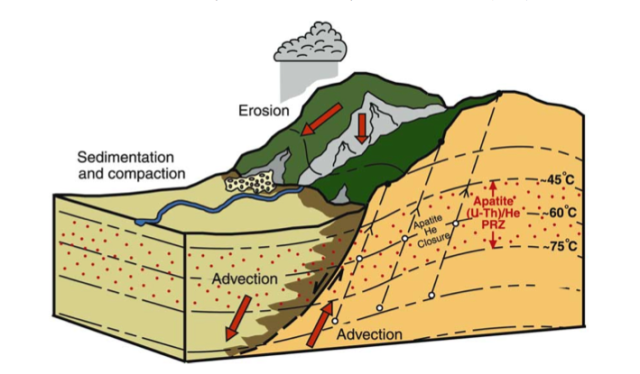
Figure 1 from Ehlers, T., and Farley, K.A., 2003, Apatite (U–Th)/He thermochronometry: methods and applications to problems in tectonic and surface processes: Earth and Planetary Science Letters, v. 206, no. 1-2, p. 1–14.
In the fascinating and spectacular world of thermochronology seminars, Figure 1 from Ehlers and Farley (2003) reigns supreme. Understandably, it is a great figure, and is perfect for introducing thermochronology to a general audience.
The thing that these figures have in common is the combination of simplicity, summary, and information density. This may be true for all figures, but when you are giving a talk you want to me able to highlight the important features of a figure in less than a few minutes, and be able to return to it, or to layer more information on top of it, with ease. In addition, the ideal talk figure is broad enough that you can use it to set up your big questions, and even return to it when you sum things up. Ideally, the best talk figures can be recycled and used in multiple talks.
There have to be others. If you feel so motivated, please point me towards the figures you are constantly running into!


Google (which is what real world people use ) gives Zachos an h-index of 62, and records 4260 citations of that paper, or a bit less than one every million years since the oceans formed.
If you want to isolate graphic effectiveness of a figure, then presumably you would want to normalize appearances against citations to determine appearances per citation (0.007, in the case of the Zachos curve).